The Ultimate Guide to Mixing Prints: Create Bold Outfits
Anúncios
Mastering the art of mixing prints allows fashion enthusiasts to create unique, bold, and stylish outfits that express individuality and confidence, transforming a simple wardrobe into an exciting canvas for personal expression.
Are you ready to transform your wardrobe from predictable to powerfully personal? The Ultimate Guide to Mixing Prints: Create Bold and Stylish Outfits with Confidence is your definitive resource. This guide delves into the fascinating world of print mixing, offering practical advice and creative inspiration to help you unlock a new dimension of sartorial expression. Whether you’re a novice or looking to refine your skills, we’ll equip you with the knowledge and confidence to combine patterns fearlessly and fashionably.
understanding the basics of print mixing
Venturing into the realm of print mixing can seem daunting at first. The key is to understand that it’s not about randomness but about creating visual harmony through intentional choices. It’s an art that balances contrast and coherence, allowing different patterns to complement rather than clash.
Before diving into specific techniques, it’s essential to grasp the foundational principles. Think of prints as individual pieces of a puzzle. While each is unique, they can form a compelling overall picture when thoughtfully assembled. This involves considering scale, color palette, and the overall aesthetic you wish to achieve.
what are prints and why mix them?
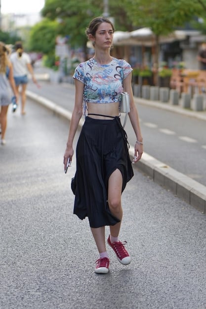
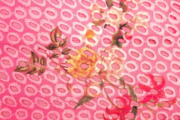
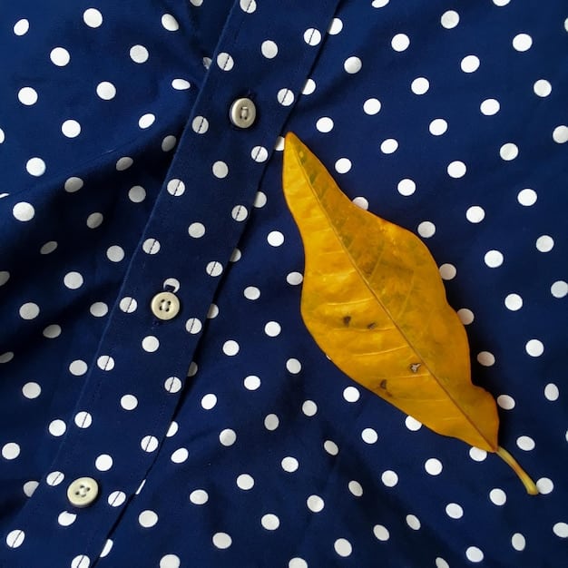
Prints are essentially visual patterns repeated on fabric. They range from classic geometric shapes like stripes and polka dots to organic forms such as florals and animal prints. Mixing them adds depth, character, and a unique narrative to your outfit. It’s a powerful way to showcase personal style and break away from monotonous fashion norms.
- Express Individuality: Print mixing is a direct reflection of your personality, allowing for boundless creativity.
- Boost Confidence: Successfully combining patterns makes a statement, exuding boldness and self-assurance.
- Maximize Wardrobe: It encourages repurposing existing pieces, creating fresh looks without new purchases.
- Enhance Visual Interest: A mixed-print outfit immediately draws the eye, making it memorable.
The beauty of prints lies in their versatility. A simple striped top can be transformed when paired with a contrasting floral skirt, creating an ensemble that feels both sophisticated and playful. It’s this interplay that makes print mixing so captivating, turning everyday garments into extraordinary statements.
common misconceptions about print mixing
Many shy away from mixing prints due to common misconceptions, often believing it leads to chaotic or unflattering looks. However, with the right approach, print mixing can be incredibly chic and polished. Debunking these myths is the first step toward embracing this exciting fashion trend.
One prevalent myth is that all prints must be within the same color family. While this is a safe starting point, it’s far from a rule. Contrasting colors can create dynamic and striking combinations if done thoughtfully. Another misconception is that only certain body types can pull off mixed prints. In reality, strategic print mixing can flatter any silhouette by drawing attention to desired areas.
Successfully mixing prints isn’t about rigid rules, but about developing an intuitive understanding of balance and proportion. By experimenting with different scales and textures, you can create unexpected yet harmonious pairings. Ultimately, the goal is to make the prints work together in a way that feels cohesive and visually appealing, rather than disjointed. It’s about finding that sweet spot where individual patterns merge to tell a unified style story, enhancing your fashion repertoire with confidence and flair.
the golden rules of print mixing
While print mixing celebrates individuality and breaking norms, a few “golden rules” can serve as a helpful framework. These guidelines aren’t meant to restrict but to empower you with a starting point, ensuring your mixed-print outfits look intentional and stylish, rather than accidental. They provide a foundation upon which to build your personal print-mixing repertoire, allowing for creative experimentation while maintaining a cohesive aesthetic.
Adhering to these principles can prevent common pitfalls, such as creating overwhelming or disjointed looks. Think of them as design principles guiding your choices, helping you create balance, harmony, and visual interest within your ensemble. Once you’re comfortable with these basics, you can confidently bend or even break them to develop your signature style.
rule 1: play with scale
One of the most effective strategies for successful print mixing is to vary the scale of your patterns. Pairing a large, bold print with a smaller, more subtle one creates visual interest without competing for attention. This contrast in scale allows each print to stand out while complementing the other.
- Large + Small: Combine a dominant large print (e.g., a wide stripe or large floral) with a delicate, smaller print (e.g., a tiny polka dot or subtle plaid). This creates a balanced visual hierarchy.
- Medium + Small: For a less dramatic but equally effective approach, pair a medium-sized print with a smaller, more detailed one.
- Avoid Same Scale: Generally, avoid mixing two prints of the exact same scale, as they tend to clash and create a busy, unharmonious look.
For instance, a wide-striped top paired with a skirt featuring delicate floral motifs illustrates this rule perfectly. The stripes provide a strong graphic element, while the small flowers introduce softness and intricate detail. This interplay prevents either print from becoming overwhelming, resulting in a cohesive and visually stimulating outfit that catches the eye for all the right reasons.
rule 2: choose a common color palette
Color is a powerful unifying element when mixing prints. Even if your prints are wildly different in style and scale, finding an overlapping color or a cohesive color palette will instantly make your outfit look intentional and well-thought-out. This cohesion creates a visual thread that ties everything together, ensuring your ensemble feels harmonious.
Consider patterns that share at least one color. For example, a floral print with hints of navy could be perfectly paired with a striped shirt that also features navy. This shared hue acts as an anchor, creating a sense of unity even between disparate patterns. Neutral colors like black, white, gray, and beige are excellent for bridging different prints, as they provide a calming backdrop against bolder patterns.
Alternatively, you can opt for prints within the same color family, such as various shades of blue or green. This tonal approach offers a subtle yet sophisticated way to mix prints, resulting in an outfit that feels coordinated without being monotonous. The common color palette ensures that despite the pattern variation, the overall look remains integrated and stylish, demonstrating a keen eye for balanced aesthetics.
rule 3: incorporate a neutral anchor
When in doubt, introducing a neutral element can be a game-changer in print mixing. A solid neutral piece acts as a visual break, preventing the outfit from becoming too overwhelming and allowing the prints to truly shine. This anchor provides a sense of balance and sophistication, grounding the more vibrant patterns.
This neutral anchor can be anything from a solid-colored top, bottom, or an accessory like a belt or a jacket. For example, if you’re mixing a bold plaid with a subtle check, a plain black t-shirt or a simple denim jacket can provide the necessary visual respite. It allows the eye to rest, appreciating each pattern individually before taking in the entire ensemble.
The strategic placement of a neutral piece can also influence the overall silhouette and how the prints are perceived. A neutral bottom can highlight a printed top, while a solid blazer can frame a patterned dress. This technique simplifies the print-mixing process, making it more approachable for beginners and offering a refined touch to any mixed-pattern outfit. It’s a reliable way to ensure your bold choices remain chic and coherent.
mastering common print combinations
Beyond the foundational rules, specific print combinations have proven incredibly effective time and again. Understanding these classic pairings can provide a solid starting point for your print-mixing journey, allowing you to build confidence before venturing into more experimental territory. These combinations often rely on inherent similarities or complementary visual traits that make them naturally harmonious. By mastering these tried-and-true pairings, you’ll develop an intuitive sense of what works, empowering you to create incredibly stylish and cohesive looks.
Experimenting with these combinations will illustrate the principles of scale and color in action, reinforcing your understanding of how different patterns interact. Think of them as building blocks; once you’re adept at using them, you can start deconstructing and recombining elements to forge truly unique and personal ensembles. The goal is to move from simply following rules to instinctively crafting beautiful and balanced outfits.
stripes and florals: a timeless duo
The combination of stripes and florals is arguably one of the most beloved and versatile in print mixing. Their inherent contrast makes them uniquely complementary. Stripes, with their clean, linear nature, provide structure and a sense of order, while florals introduce organic softness, romance, and artistic flair. This juxtaposition creates a dynamic yet balanced visual story.
- Classic Approach: Pair a striped top (Breton stripes are excellent) with a floral skirt or trousers. Ensure one print is larger in scale than the other.
- Unexpected Twist: A floral blouse under a striped blazer or a floral scarf with a striped dress.
- Color Harmony: Look for a shared color between the stripes and a minor detail in the floral print to ensure cohesion.
This pairing works beautifully because the geometric precision of stripes grounds the more whimsical nature of florals. Consider a navy and white striped t-shirt with a midi skirt brimming with vibrant poppies. The navy in the stripes can echo a darker shade within the floral pattern, creating a seamless flow that is both eye-catching and elegantly coordinated. This classic duo proves that opposites truly can attract in fashion, forming an outfit that is both fresh and enduringly stylish.
animal prints with anything (almost!)
Animal prints, especially leopard and snake print, have evolved from bold statements to fashion neutrals. Their unique texture and often earthy tones make them surprisingly versatile, capable of being paired with a wide range of other prints. The key is to treat them as you would a solid color, using them to anchor or elevate other patterns. The trick lies in balancing their inherent boldness with other patterns.
Leopard print, for example, often features black, brown, and tan, making it easy to integrate with colors found in other prints. Try pairing a leopard print skirt with a simple striped top for an instant chic look. Or, for a more daring approach, combine it with a playful polka-dot blouse. The trick is to let the animal print be the more dominant, or “loud,” print, allowing the other pattern to be a bit more subdued or classic. This balance ensures the outfit reads as sophisticated rather than overwhelming.
Snake print, with its subtle scales and often monochromatic palette, offers another avenue for effortless print mixing. It pairs beautifully with pinstripes for a sophisticated work look or with abstract geometric patterns for a modern edge. The versatility of animal prints lies in their ability to act as a bridge between different styles, proving that “wild” can indeed be wonderfully wearable when mixed with intelligent discernment.
advanced print mixing techniques
Once you’ve mastered the basics, it’s time to elevate your print-mixing game. Advanced techniques push the boundaries, allowing for truly distinctive and high-impact outfits. These methods involve a deeper understanding of visual weight, pattern juxtaposition, and the psychology of color, moving beyond simple pairings to create complex yet cohesive sartorial statements. It’s about developing an intuitive eye for how different elements interact, transforming your wardrobe into a playground for creative expression.
This next level requires a bit more experimentation and a willingness to embrace boldness. It’s where personal style truly shines, as you begin to craft looks that are uniquely yours. Don’t be afraid to try combinations that initially seem unconventional; often, the most unexpected pairings yield the most stunning results. The goal is to create a dynamic visual narrative that reflects your confidence and fashion-forward sensibility.
monochromatic print mixing: subtle impact
One of the most sophisticated ways to mix prints is through a monochromatic palette. This technique involves combining different prints that share the same dominant color or are within the same color family. The lack of color contrast allows the texture and pattern itself to take center stage, creating a subtle yet incredibly impactful look that feels cohesive and artful. This approach offers a refined way to incorporate multiple patterns without overwhelming the eye, resulting in an ensemble that is visually rich and elegantly understated.
For example, you could pair a navy pinstripe blazer with a navy polka-dot blouse. While both are distinct patterns, their shared color ensures they work in harmony. Similarly, a dress with abstract white and gray prints could be layered with a jacket featuring a houndstooth pattern in similar grayscale tones. The consistency in color creates a seamless flow, allowing the eye to appreciate the subtle interplay of various patterns and textures without distraction.
This method is particularly effective for those who desire a bold statement but prefer a more refined aesthetic. It allows for the intricacy of print mixing without venturing into overtly colorful or high-contrast territory. Monochromatic print mixing proves that impact can be achieved through subtlety, elevating your style with a sophisticated and cohesive visual narrative, demonstrating a nuanced understanding of fashion dynamics.
mix prints with similar textures
Beyond color and scale, considering the texture of your prints can unlock new levels of sophistication in your mixed-print outfits. Combining prints that have a similar tactile feel, or even appear to have similar textures, creates a harmonious blend that is pleasing to both the eye and touch. This technique adds an extra layer of depth and cohesion, making your patterns feel more integrated.
Imagine pairing a subtly textured jacquard print with a soft velvet pattern that mimics a subtle geometric design. Both fabrics have a plush, luxurious feel, even if their visual patterns are different. Similarly, a crisp cotton pinstripe shirt might pair wonderfully with linen trousers featuring a delicate floral print; the natural, breathable feel of both fabrics creates a unified aesthetic. This approach works because the sensory experience of the fabric supports the visual interplay of the patterns, resulting in a more cohesive and luxurious ensemble.
When textures are overtly clashing, like a thick tweed with a sheer silk, even harmonious prints might feel disjointed. By aligning the textural weight and feel, you reinforce the visual harmony of your mixed prints, creating an outfit that feels curated and thoughtfully composed. This attention to fabric quality and feel elevates the entire look, transforming simple print mixing into a truly artful expression of style.
the “one bold, one subtle” approach
This technique is a cornerstone of advanced print mixing for good reason: it rarely fails. The principle is simple—let one print be the undeniable star, and pair it with a second, more subdued pattern that provides support without competing. This creates a balanced visual hierarchy, ensuring your outfit is striking without being overwhelming. The “one bold, one subtle” approach allows for confident expression while maintaining a sophisticated and intentional aesthetic, making it an ideal choice for pushing boundaries stylishly.
For instance, if you have a vibrant, large-scale abstract print dress, pair it with a classic, small-scale houndstooth blazer or a micro-dot scarf. The bold print immediately captures attention, while the subtle print adds an element of visual interest and texture without stealing the spotlight. The contrasting levels of intensity create a dynamic yet harmonious look, demonstrating a sophisticated understanding of visual weighting.
This method is particularly effective when venturing into mixing patterns that might seem disparate at first glance. By ensuring a clear protagonist and supporting cast among your prints, you maintain control over the outfit’s overall impression. It’s about creating a conversation between patterns where one speaks louder, and the other offers a quiet, complementary whisper, resulting in an ensemble that is both daring and perfectly composed, a true testament to refined print-mixing skills.
accessories: the secret weapon in print mixing
Accessories are often underestimated in their power to transform an outfit, and in the world of print mixing, they are truly your secret weapon. They offer a low-commitment way to experiment with patterns, inject personality, and flawlessly tie together a mixed-print ensemble. A well-chosen accessory can bridge disparate patterns, add a pop of contrasting print, or provide a neutral anchor, elevating your entire look with minimal effort. This versatility makes them indispensable tools for any print-mixing enthusiast.
Whether it’s a scarf, a handbag, shoes, or even jewelry, accessories allow you to introduce a print without the commitment of a full garment. This makes them ideal for testing the waters with new combinations or for adding a final flourish that pulls all elements into a cohesive, stylish statement. Thinking strategically about your accessories can transform an ordinary outfit into an extraordinary one, making them integral to confident print mixing.
scarves, belts, and jewelry
Scarves are perhaps the most versatile accessory for print mixing. A patterned silk scarf can introduce a new print to an otherwise solid or simply printed outfit, or it can be used to tie together two existing prints by sharing a common color. Wear it around your neck, as a headscarf, or even tied to your handbag to add an unexpected touch of pattern.
- Scarves: Use a printed scarf to introduce a complementary (or contrasting!) pattern. Its smaller scale makes it less intimidating.
- Belts: A printed belt can break up a larger block of print or add a subtle pattern to a solid outfit. Consider animal print belts for their versatility.
- Jewelry: While not a fabric print, statement jewelry with bold geometric or organic designs can mimic the visual effect of prints, adding another layer of texture and pattern to your ensemble.
Belts offer an excellent opportunity to define your waist and introduce a print in a structured way. A narrow patterned belt over a monochromatic outfit can add just the right amount of visual interest. Finally, while not traditional fabric prints, jewelry pieces with intricate patterns or bold, abstract designs can act as subtle nods to print mixing, enriching your overall look with varied textures and shapes.
shoes and handbags: your final flourish
Shoes and handbags are perhaps the easiest and most impactful accessories for incorporating or complementing mixed prints. They offer a fantastic way to introduce a print without it being alongside another print on your body, giving you more freedom to play with bolder patterns. A printed shoe or handbag can instantly elevate a simple outfit or provide that final unifying touch to a complex mixed-print ensemble.
Imagine a plain black dress suddenly transformed by a pair of leopard print heels and a matching clutch. Alternatively, if you’re already mixing a floral top with striped pants, a solid-colored handbag and shoes can provide a necessary visual break, allowing the main prints to shine without competition. When opting for printed shoes or bags to complement other prints, consider the overarching color palette. A handbag with a subtle geometric print that shares a color with your clothing prints creates a cohesive and polished finish.
These accessories allow you to make a statement without committing to a full garment. They are excellent for experimenting with trending patterns or for adding a pop of unexpected print. By thoughtfully selecting your shoes and handbag, you can refine your print-mixing strategy, creating outfits that are not only bold and stylish but also incredibly coherent and well-thought-out, proving that attention to detail truly makes the difference.
common mistakes to avoid
While print mixing is about creative liberation, avoiding certain pitfalls can save your outfit from looking chaotic or unpolished. Understanding these common mistakes allows you to navigate the world of patterns with more confidence and intentionality. It’s not about stifling creativity but about ensuring your stylistic choices consistently result in a cohesive and visually appealing ensemble. Recognizing these errors helps refine your approach, transforming potential fashion faux pas into sophisticated style statements.
Think of it as refining your eye. By being aware of what typically doesn’t work, you can more easily identify combinations that do. This allows for more deliberate and successful experimentation, fostering a deeper understanding of how colors, scales, and textures coalesce to form a harmonious look. Avoiding these common missteps empowers you to take bolder steps with your print mixing, knowing you have a solid foundation.
overdoing it: too many prints
One of the most frequent mistakes in print mixing is simply using too many different patterns. While it’s tempting to incorporate every print you love, an excessive number of competing patterns can lead to a busy, overwhelming, and ultimately unflattering look. The eye struggles to find a focal point, resulting in visual clutter rather than intentional style.
Generally, limit yourself to two or three distinct prints per outfit. If opting for three, ensure one is significantly more subtle or acts as a neutral. For example, a striped top and floral skirt might be perfectly balanced with a small polka-dot scarf. Adding a fourth, loud pattern would likely push the outfit into chaotic territory. Remember, less can often be more when it comes to patterns, allowing each print to be appreciated for its individual beauty within a cohesive whole.
The goal is to create harmony, not a jumble. Think of your outfit as a curated collection rather than a free-for-all. By exercising restraint and intentionally selecting your prints, you allow each pattern to contribute effectively to the overall aesthetic without drowning out its companions. This careful curation ensures your mixed-print ensemble feels sophisticated and intentional, rather than haphazardly thrown together.
ignoring silhouette and proportion
Print mixing isn’t just about the prints themselves; it’s also crucial to consider how these patterns interact with the silhouette and proportions of your outfit. A beautifully mixed set of prints can still look off if the garments themselves don’t flatter your shape or the proportions are out of balance. Patterns can emphasize or de-emphasize certain areas, so mindful selection is key.
For example, large, bold prints can sometimes add visual volume, while smaller, daintier patterns tend to be more forgiving. If you’re mixing a large-scale print, balance it with a piece that offers a streamlined silhouette. Similarly, if you have a top with a busy print, consider pairing it with a simpler, more structured bottom to create visual equilibrium. The way prints are placed on your body can also impact perception: vertical stripes elongate, while horizontal ones can widen.
The overall shape of your outfit should always be considered alongside your print choices. An A-line skirt with a floral print can be paired with a fitted striped top to maintain a balanced proportion, for instance. Ignoring silhouette and proportion essentially means ignoring how the prints will visually interact with your body, which is critical for a flattering and stylish outcome. Always ensure your chosen patterns enhance, rather than detract from, the overall harmony and fit of your ensemble for a truly polished look.
building your print-mixing confidence
The journey to mastering print mixing isn’t just about understanding rules and techniques; it’s also about building the confidence to experiment and express your unique style. Fashion should be fun, and print mixing is an incredible avenue for playful self-expression. Starting small and gradually pushing your boundaries is the most effective way to cultivate confidence and develop an intuitive sense of what works for you. Remember, every fashion icon started somewhere, and learning through experimentation is part of the process.
Don’t be afraid of making mistakes. Sometimes, the outfits that seem a bit “off” at first can lead to breakthroughs in your understanding of pattern interplay. Embracing this process, viewing each attempt as a learning opportunity, will ultimately lead to a more fearless approach to your personal style. The goal is to move from hesitation to a natural inclination to combine patterns expertly and with joy. Begin with a single step, and soon you’ll be leaping with sartorial assurance.
start small: accessories first
If the idea of mixing an entirely printed outfit feels overwhelming, begin with accessories. This low-commitment approach allows you to introduce patterns in a controlled manner, helping you get comfortable with the concept without feeling like you’ve gone “too far.” Accessories are a fantastic testing ground for new combinations and can inject personality into even the simplest of outfits, making them perfect for building initial confidence.
Try pairing a plain black dress with a vibrant floral scarf. Or, add a subtle pinstripe belt to a solid jumpsuit. A leopard print handbag with a striped top and neutral bottom is another excellent starting point. These small touches allow you to observe how different patterns interact and how they make you feel, without the pressure of a full-scale printed ensemble. They are easy to swap out if you’re not happy with the result, making the learning process stress-free and enjoyable.
Once you’re comfortable with mixing printed accessories, you can gradually move on to incorporating one printed garment, then two, and so on. This incremental approach builds your confidence organically, allowing you to develop a keen eye for pattern harmony. Starting with accessories truly empowers you to dip your toes into the bold waters of print mixing at your own pace, fostering a natural progression to more complex and striking outfits. It is the perfect low-risk, high-reward starting point.
practice and experiment
There’s no substitute for hands-on practice when it comes to mastering anything, and print mixing is no exception. The more you experiment with different combinations, the more intuitive your understanding of what works and what doesn’t will become. Don’t be afraid to try on seemingly unlikely pairings in front of the mirror. Sometimes, what looks questionable on a hanger can be surprisingly chic when worn. This active experimentation is crucial for developing your unique aesthetic and truly understanding the nuances of how prints interact. It’s an ongoing process of discovery and refinement.
Take inspiration from fashion magazines, social media, and street style, but always adapt it to your wardrobe and personal taste. Don’t be afraid to mix high-end pieces with affordable finds. Document your successful combinations, and learn from the ones that don’t quite hit the mark. The more you play with patterns, the more confident and skilled you’ll become in creating truly unique and stylish outfits. This iterative process of trying, learning, and refining is what transforms a novice into a confident print-mixing maestro, unlocking endless possibilities for self-expression through fashion.
The beauty of print mixing lies in its boundless potential for creativity. Every outfit you put together is an opportunity to tell a new story, to express a different facet of yourself. By continuously practicing and experimenting, you not only improve your fashion sense but also cultivate a deeper connection with your personal style. This journey of exploration is incredibly rewarding, proving that the best way to become confident is simply by doing.
| Key Principle | Brief Description |
|---|---|
| 📏 Vary Scale | Combine large prints with small ones for visual harmony. |
| 🎨 Common Color | Ensure prints share at least one color for cohesion. |
| 💡 Neutral Anchor | Use a solid neutral piece to break up print intensity. |
| 🌟 Start Small | Begin with printed accessories to build confidence gradually. |
frequently asked questions about mixing prints
Yes, you can absolutely mix more than two prints! The key is to manage their scale and color palette effectively. For three prints, try to make one a subtle neutral base (like stripes or small polka dots) while the other two are distinct. Always ensure there’s a unifying element, such as a shared color or similar texture, to maintain cohesion and prevent visual chaos and overwhelm.
The easiest way to begin is by pairing a printed accessory with a solid-colored outfit, or by combining a classic subtle print (like stripes or polka dots) with a bolder one. Scarves, belts, and shoes are excellent starting points. This low-commitment approach allows you to experiment with patterns and see how they interact without committing to a full mixed-print ensemble, building confidence gradually.
Not necessarily. While choosing prints within the same color family is a safe and stylish approach, you can also mix patterns with contrasting colors. The trick is to ensure that at least one shared color exists between them, or that one of the prints incorporates a neutral color found in the other. This creates a visual bridge, allowing different hues to blend harmoniously and intentionally.
To avoid a busy look, focus on varying the scale of your prints (one large, one small). Incorporate a neutral piece, like a solid-colored top or bottom, to give the eye a resting point. Limit the number of prints to two or three. Also, consider the overall silhouette; a more streamlined cut can balance bolder prints, ensuring the outfit remains polished and chic, not overwhelming, to the eye.
While fashion is about personal expression, it’s generally best to avoid mixing too many prints of the exact same scale or intensity, as they tend to compete rather than complement. Also, be cautious when mixing overly similar prints that are just slightly different in color or design, as this can look like a mistake rather than an intentional mix. Trust your eye, and when in doubt, simplify your combination.
conclusion
Mastering the art of print mixing is a journey of discovery that transcends rigid rules, embracing creativity and personal expression. By understanding the foundational principles of scale, color, and texture, and by experimenting with confidence, you can transform your wardrobe into a vibrant canvas. Remember to start small, leverage accessories, and always let your intuition guide you. The power to create bold, stylish, and uniquely ‘you’ outfits is now within your grasp, encouraging you to step out with renewed confidence and an unmistakably personal flair.


